Starting data analysis/wrangling with R: Things I wish I'd been told
October 14, 2014, [MD]
R is a very powerful open source environment for data analysis, statistics and graphing, with thousands of packages available. After my previous blog post about likert-scales and metadata in R, a few of my colleagues mentioned that they were learning R through a Coursera course on data analysis. I have been working quite intensively with R for the last half year, and thought I'd try to document and share a few tricks, and things I wish I'd have known when I started out.
I don't pretend to be a statistics whiz – I don't have a strong background in math, and much of my training in statistics was of the social science "click here, then here in SPSS" kind, using flowcharts to divine which tests to run, given the kinds of variables you wanted to compare. I'm eager to learn more, but the fact is that running complex statistical functions in R is typically quite easy. The difficult part is acquiring data, cleaning it up, combining different data sources, and preparing it for analysis (they say 90% of a data scientist's job is data wrangling). Of course, knowing which tests to run, and how to analyze the results is also a challenge, but that is general statistical knowledge that applies to all statistics packages.
So here are some of my suggestions and "lessons learnt", in no particular order. Some will find the code samples scary, others will find the suggestion to use for-loops far too basic, but hopefully you will find something useful here.
Use RStudio
RStudio is an great open source integrated development environment for R. It is free and open-source, and integrates
- a project manager
- a text editor with syntax highlighting and tab-completion
- package management
- previewing plots
- previewing tables (see columns and rows in your dataset)
- integrated help (click F1 on any function)
- jump to source (click F2 on any function)
- and Knitr (write reports in Markdown, see below)
There's even a version of RStudio that runs in the browser – we're currently using it to coordinate data analysis among a geographically dispersed team on many gigabytes of data. Keeping it on a central server, and letting people run analyses directly on the data is much more convenient and secure than having everyone store tens of gigabytes of data on their personal computers.
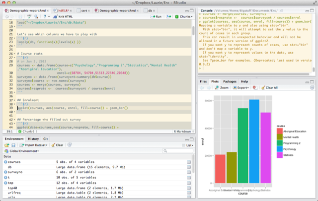
Use Knitr
Literate programming is the idea of mixing executable code with documentation in the same document. Knitr brings this functionality to R, and it's integrated beautifully with RStudio. By default, all the text you write in a Knitr document is interpreted as Markdown (a light-weight markup language, which I'm also using to author this blog). Press Alt+Cmd I to insert an R code block. You can run the code either by pressing Cmd+Enter on a single line, or Alt+Cmd C to execute an entire code block. When you're done, you can press "Knit HTML", which executes the whole document and produces a report.
Here's an example from some recent work analyzing a questionnaire, we're introducing the graph, and then adding the code that will produce the graph (see my previous blog post on likert-graphs):
Running Knit HTML combines the text, formatted nicely, the code used to generate the graph, and the actual graph:
For the final report, you might choose to hide all the code segments with this invocation:
library(knitr)
opts_chunk$set(echo=F, warning=F,message=F,results="asis", prompt=F, error=F)
Not only is this a great way of writing reports (you can also export to PDF, or even write in LaTeX instead of Markdown), but it's a very nice way of organizing your code. I now do all my development in this mode, even for scripts where I'm not interested in the final report. I like the ease of documenting, the clear visual separation of the different code blocks, and the ease of pressing Alt+Cmd C to execute a single code block.
I recently gave a small demo to a research group, showing them RStudio, using Markdown to write knitr reports, and Shiny to make interactive webpages:
Learn from others
There are lot's of R textbooks and documentation out there. Two other great sources of ideas are RPubs and r-bloggers. Using knitr to write reports in RStudio, as described above, you have the option to upload your report to RPubs. You can also see all the reports that others have written. These are great to learn from, since they typically contain both all the code, and the output and graphs, tying it all together into an analytical narrative. Unfortunately, there is no good way of searching the site, so you will find people's homework nestled between great expository writing, but it's still well worth a visit. You can also visit the knitr notebook showcase to see some select examples.
R-bloggers is an aggregator for blog-posts about R and statistics, and it's a great way to discover new packages or R features, and see how other people attack various data analysis challenges, often using publicly available datasets.
Separate cleaning and organizing from analysis
Although R is a fully-fledged (although a bit crufty) programming language with object-orientation and functions, the code that users typically write is very different from an R package. Users usually write very imperative code, "load this file, then transform the second column, then add the third column, then graph it". However, acquiring some good habits of organizing the code and working with the data, might save you a lot of time in the long run. (Also see the section on DRY below)
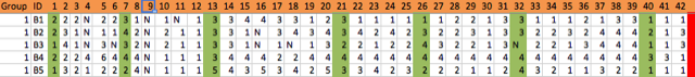
I usually separate data importing and cleaning from the analysis. My goal is to leave the raw data completely unchanged, and do all the transformation in code, which can be rerun at any time. While I'm writing the scripts, I'm often jumping around, selectively executing individual lines or code blocks, running commands to inspect the data in the REPL (read-evaluate-print-loop, where each command is executed as soon as you type enter, in the picture above it's the pane to the right), etc. But I try to make sure that when I finish up, the script is runnable by itself.
Knitr helps impose this - when you choose Knit HTML, it begins with a clean slate. When you are working in RStudio, you might have objects lying around from calculations you did a while ago (with code that you've already changed), but if the "knitting" is successful, you know that the current code is valid and produces exactly what you see.
Example of preparing data
In one example, I had gotten spreadsheets from several students who had helped me enter data from a large survey. I could have opened these in Excel, and copied and pasted the information into one sheet, but instead I left the files as they were, and read them into R. I tag the columns from each spreadsheet with provenance, if I want to run any quick tests, or even more formal interrater reliability tests, and merge them into one table. In some spreadsheets, there was an extra empty column, so I remove that programmatically (rather than editing the Excel spreadsheet). First I load xlsx to read the Excel spreadsheets, and plyr to rename fields later.
library(xlsx)
library(plyr)
Then I read in and join the spreadsheet files:
ana <- read.xlsx(file="ana.xlsx", 1,stringsAsFactors=FALSE)
ana$by <- "Ana"

chad <- read.xlsx(file="chad.xlsx", 1,stringsAsFactors=FALSE)
chad[["NA."]] <- NULL
chad$by <- "Chad"

dd <- read.xlsx(file="DD.xls", 1,stringsAsFactors=FALSE)
dd$by <- "DD"

db <- rbind(ana, chad, dd)
I noticed that some of the spreadsheets had a bunch of empty rows at the bottom. This might not be the most elegant way, but I used this function to remove all the spreadsheets with all empty values. The way this works is that is.na(x) produces a list of "TRUE TRUE FALSE FALSE TRUE" depending on which of the columns has an NA for that particular row, and sum() adds up the TRUE's as 1, and FALSE's as 0.
db2 <- db[apply(db,1, function(x) {
  sum(is.na(x)) < 43}),]
Then I move on to turn all the various versions of "empty cell" into NA:
db <- as.data.frame(lapply(db2, function(x){
  x <- replace(x, x %in% c("n", "N", ""), NA)
  x <- as.factor(x)}))
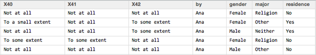
Some of the columns are demographic values, so I'll change these from numeric to categorical variables with the actual values:
db$gender <- revalue(db$X1, c("1"="Male", "2"="Female", "3"="Trans", "4"="Other", "5"=NA))
db$major <- revalue(db$X2, c("1"="History", "2"="Religion", "3"="Other"))
And the rest of the questions are likert-style questions with the same categories, so I'll both rename them and order them in one swoop:
likertcat <- c("1"="Not at all", "2"="To a small extent", "3"="To some extent",
  "4"="To a moderate extent", "5"="To a large extent")

for(e in names(db[,9:44])) {
  db[[e]] <- revalue(db[[e]], likertcat)
  db[[e]] <- ordered(db[[e]], levels= c("Not at all","To a small extent",
    "To some extent","To a moderate extent","To a large extent"))
}
I also add categories and groupings using my own addition, which you can read more about, and finally I save the new table as an RData file:
save(db, file="db.RData")
I should always be able to re-run this script, and re-generate the exactly same RData file, but typically the only time I'll re-run the script is if I get additional data (let's say two other students send me their data entry files).
I then begin the data analysis script with
load(file="db.RData")
And we have a nicely prepared table that we can begin exploring.
Use version control
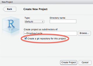 RStudio comes with support for git baked in, and it's a great practice to use it. When you create a new project, check the box for "Create a git repository for this project", and you get all this functionality for free. Once you have a functioning version of your script, commit it to Git, and when you later make changes, you can easily track those changes back in history, restore earlier versions, etc. This is great for people collaborating, but it's actually a great idea to start doing it even on solo-projects, and can save you a lot of grief in the future. RStudio has a good writeup of this functionality.

Of course, if you are able to do so, it would be great if you could share your scripts (and data) on GitHub or another public repository. Even in cases where you can't share your raw data (because of ethics, etc), your code could be useful to others. (I have shared some of the code we used to analyze Coursera MOOC data in a GitHub repository, but I could probably go through my folders and find more snippets of code to share).
Learn the DSLs in R
DSL stands for domain-specific language, and the key to being efficient in R (and one of the reasons beginners might feel that the learning curve is very steep), is to realize that R is actually composed of several different embedded languages. Most end-users of R actually don't need to know very much about the R programming language, mostly people write scripts in a very imperative way "first do this, then do this, then do that". There are probably data analysts that have used R for years, and never written a function or a loop statement.
However, if you want to plot graphics with ggplot, you will have to learn an entirely new way of thinking. It is based on the Grammar of Graphics, and makes it possible to intuitively build up exactly the kind of graph you want, based on layers, mapping data to geometries such as bar-charts, etc. However, if you don't understand the underlying logic, even making the simplest plot will seem like a strange incantation.
Similarly, for data wrangling, there are several options. The plyr family of functions is very powerful, for example here is how you would take a data.frame with per-country data, and calculate per-continent summary statistics:
ddply(gDat, ~ continent, summarize,
      minLifeExp = min(lifeExp), maxLifeExp = max(lifeExp),
      medGdpPercap = median(gdpPercap))
An alternative is to use data.table. Data.table is an alternative to the built-in data.frame, which is much more performant for large datasets, and also offers powerful indexing, transformation/grouping, and merging/joining. It has a very dense syntax, which is powerful once you understand the logic. Here is an example of calculating a number of statistics on a football dataset:
dt.statsPlayer <- dt.boxscore.subset[,list(minutes=sum(minutes),
                                           mean=mean(pp48),
                                           min=min(pp48),
                                           lower=quantile(pp48, .25, na.rm=TRUE),
                                           middle=quantile(pp48, .50, na.rm=TRUE),
                                           upper=quantile(pp48, .75, na.rm=TRUE),
                                           max=max(pp48)),
                                     by='player']
(Note also the use of white-space, R often let's you space expression out over several lines, which can help a lot with readability).
The key to getting proficient in R is to choose one main way of doing things, for example ggplot2 for all graphics (and not worrying about learning grid and lattice plotting), and either data.table or plyr, and focusing on understanding their underlying logic, and using them frequently.
DRY - Don't repeat yourself
This used to be a mantra when programming Ruby, but is often overlooked in R code. Since many people think of doing analysis in R as simply writing a number of instructions to be executed linearly, we forget that the language let's us be much more efficient. I did say above that you don't need to understand the R programming language in depth to use R profitably, however, a few features are very useful.
The advantage of avoiding repetition is that your code becomes easier to read (because your intention stands out), and it becomes much easier to reuse code, and to update. Let's say you are plotting five or six similar plots, and in each case you have a big blob of ggplot2 code, with layers, themes, etc. Now your boss tells you to change the theme of all the plots. Rather than jumping around and editing a bunch of lines, perhaps introducing new errors, you could try to abstract out the plotting code to a function, which you'd only need to edit once.
Turning often used code into functions
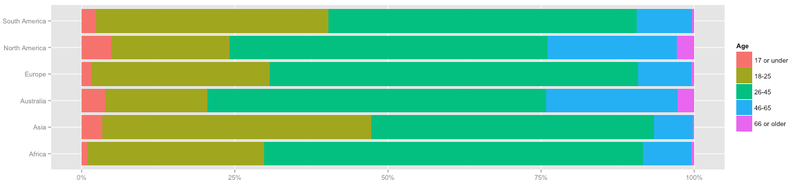 Here's an example of a simple plot I used frequently in an exploratory report I wrote about MOOC data. I first clean out the NAs from the dataframe, and then display it as a colored bar chart, where each bar corresponds to a region, and the colors correspond to age groups. The first line defines the plot, and the two subsequent lines formats it (flipping the axis, removing some clutter, adding a legend title). (Click the image to the right to see the full graph.)
dbgen <- db[!is.na(db$gender), ]
ggplot(data=dbgen, aes(region, fill=age)) + geom_bar(position="fill") +
  coord_flip() + scale_y_continuous(labels = percent) + ylab("") + xlab("") +
  guides(fill=guide_legend(title="Age"))
Since I needed a few graphs, the initial impulse would be to copy it and modify a few parameters. But how can we instead make this into a generic function? Turns out that in general we'd want to remove NAs from both the grouping and the fill column (the region column just didn't happen to have any NAs, so we didn't need to check that above), and we also need to switch to using aes_string because of how ggplot implements its "DSL", otherwise it's quite simple.
We define a function my_sideplot, which takes the full dataframe, the grouping variable, the fill variable, and an optional title for the fill legend, and generates a plot similar to the one above.
my_sideplot = function(db, group, fill, fill_title="") {
  db = db[!is.na(db[[fill]]) & !is.na(db[[group]]),]
  ggplot(data=db, aes_string(group, fill=fill)) +
    geom_bar(position="fill") + coord_flip() +
    scale_y_continuous(labels = percent) + ylab("") + xlab("") +
    guides(fill=guide_legend(title=fill_title))
}
The advantage is that I can now very easily experiment with different versions. Perhaps using the age variable for grouping, and the regions for fill is better?
my_sideplot(db, "age", "region", "Regions")
This makes my code much easier to read, since I see right away that this is doing exactly the same as the code above (otherwise you need to look very closely at the ggplot code to see what is different), and if I have a knitr report with 10-15 of these graphs, and I want them all to use theme_bw() – a black-and-white theme – I can simply modify the function, and rerun the graph.
Functions can of course be much more advanced than this, with branches and sanity checks, etc. However, as a first approximation, just taking chunks of code that are repeated with very few changes, identifying the changes and making them into parameters, and turning the code chunk into a function, can already be very useful.
Using lists and iteration
The second approach to cleaning up code is to use lists and for-loops. For example, we might want to generate plots of six different categorical variables grouped by region. Or perhaps we want them grouped by region, age, and English-skill? Now we are talking about a total of 20 graphs. We could copy and paste the one-line my_sideplot invocation above, which is already a big improvement, but we can do much better.
group_vars = c("region", "age", "english.skill")
fill_vars = c("usercat", "education.level", "degree.program")
for (groupv in group_vars) {
  for (fillv in fill_vars) {
    my_sideplot(db, groupv, fillv)
  }
}
This code will iterate through the group_vars, and for each group_var, it will iterate through the fill_vars. For each fill_var, it will render an appropriate plot.
You can also iterate through for example the columns in a data.frame. Let's say we want to turn all the character columns into factors:
for (e in names(db)) {
  if (is.character(db[[e]])) { db[[e]] <- as.factor(db[[e]])}
}
Keeping track of types in R
Again breaking against my statement that you don't need to know much of the R language, but the various data types is one of the things that has tripped me up the most. This is because certain operations can return different data types than you were expecting.
There are many R tutorials, and I am not going to give a full introduction here. The most basic datatype is the vector, and one of the peculiarities of R is that even single numbers or strings, are vectors of size one.
identical(c("hi"), "hi") # => TRUE
identical(c(1), 1) # => TRUE
A dataframe is a collection of vectors. Sometimes when you do an operation on a data.frame, you might get a vector back, or a matrix. You can usually cast one data type to another with as.*, for example as.data.frame()
> as.data.frame(list("A" = c(1,2,3), "B" = c(2,3,4)))
  A B
1 1 2
2 2 3
3 3 4
You can check the class of an object with class(),
> class(db)
[1] "data.frame"
> class(db$age)
[1] "ordered" "factor"
If you run into weird bugs, make sure that every step of the pipeline returns the data type that the next function is expecting (or explicitly cast). Also remember that certain functions work differently depending on different data types. For example, length() on a list or vector returns the number of elements. length() on a data.frame returns the number of columns, if you want the number of rows, you need nrow().
Asking questions - providing reproducible examples
There are many great resources for getting help with R, including all the books I showed pictures of at the beginning of this post. An advantage of R being text-oriented is that it is easy to paste exactly the code that is misbehaving, and for others to help out. StackOverflow has a very active R community, however you have a much higher chance of getting help if you make your problem reproducible.
Sometimes you can use the built-in data sets in R, which you can list with the command data(). For example, with the command data(swiss), I load a dataset with data on fertility and education in Swiss cantons. I can use this to illustrate a problem, and anyone else using R will have the same dataset, and can perfectly reproduce my problem, or check that their solution works correctly.
If none of the built-in datasets work, you can create a minimal example dataset that illustrates your problem. Let's say we had a problem with the a data.frame we constructed above. The command dput(a) gives us
structure(list(A = c(1, 2, 3), B = c(2, 3, 4)), .Names = c("A",
"B"), row.names = c(NA, -3L), class = "data.frame")
We can now construct our example:
a = structure(list(A = c(1, 2, 3), B = c(2, 3, 4)), .Names = c("A",
"B"), row.names = c(NA, -3L), class = "data.frame")

ggplot(a, aes(x=A, y=B)) + geom_point()
...and anyone can paste this into their R interpreter, and see the same output that you get. Longer explanation and here's a small example.
Packages to use
One of the strengths of R is the incredible selection of packages available, but this can also be quite disorienting to a beginner. Here are just a few packages that are often useful:
| Package | Description |
|---|---|
| plyr | Plyr applies the "split-apply-combine" approach to R data. You might want to calculate the average height of players, grouped by nationality and year of birth - a one-liner in Plyr. Hadley Wickham is currently developing dplyr, a faster and more powerful version |
| Shiny | Shiny let's you make interactive graphical websites with R (similar to the way we created the function above, by substituting the parts of the code that vary with variables, and letting the end-user choose the variables). Also see the video above |
| data.table | As mentioned above, a much faster version of data.frame, very well suite to larger datasets, with powerful split+apply, merge, etc. functionality offering an alternative to plyr |
| likert | If you ever deal with likert-style questionnaire data, this package makes it very easily to visualize the results. See also my addition to this package |
Hope that was useful. Once you want more, you could do worse than checking out Hadley Wickham's Advanced R book. There's also an incredible amount of good textbooks, examples, blog posts, etc.
Stian Håklev October 14, 2014 Toronto, Canada comments powered by Disqus